
In this article, I will show you how to create a circular progress bar. By using a circular progress bar instead of the usual portrait or landscape orientation, you can add a little accent to your screen, so please refer to this tutorial if you find a use for it. At the end of the tutorial, we will also show you some sample progress bars that are not circular (e.g., heart-shaped), so if you are interested, please take a look at them as well.
The final project file for this tutorial is available at GitHub repository . If you download the .zip file and import the “project.godot” file in the “End” folder with the Godot Engine, you can check the project directly.
Environment
・Godot version: 3.4.4
・Computer OS version: macOS 11.6.5
Other Articles
Please also use the following articles to help you start creating your game.
Downloading Godot
Project Manager of Godot
Preparation
Preparing an image of the circular progress bar
If you have a drawing application such as Photoshop or GIMP on your computer, you can use it. I will not go into the details of how to use drawing applications here. If you have difficulty, please Google it.
Create a circle with the center hollowed out. At this time, the color of the circle should be white. The reason is that the color can be easily set in the Godot editor. The rest of the image should be transparent. Save the image as a png file with the image size set to 300 px in height and width.
In my case, I copied a graphic object created with the “Keynote” application on Mac (a slide show creation application similar to PowerPoint on Windows PC) to the clipboard, launched the “Preview” application, created a new image from the clipboard, and saved it as a png.
If you want to skip this step, I hope you can download the image below directly from your browser (if the background is white, the image may assimilate and look like nothing…)
Creating a new project
Start Godot Engine and create a new project. You can name your project as you like. If you can’t think of one, let’s call it “Circular Progress Bar”.
Importing the prepared images.
Create a “Textures” folder directly under the resource folder (res://) in the file system dock. Drag and drop the circular image you have just prepared and import it there. The file name should be “CircularProgressBar.png” (file path is res://Textures/CircularProgressBar.png).
Create a scene
First, let’s create a CircularProgressBar scene.
Select “Scene” menu > “New Scene”.
Select the “Control” class node as the root node and rename it to “CircularProgressBar”.
Save the scene at this point. Save the scene with the file path “res://CircularProgressBar.tscn”.
Continue adding a “TextureProgress” node to the “CircularProgressBar” root node
Furthermore, add a “Label” node to the “CircularProgressBar” root node.
The scene tree should now look like this: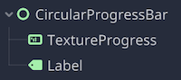
Edit Node
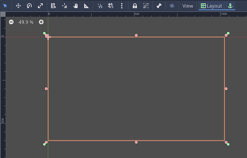
CircularProgressBar (Control) Root node
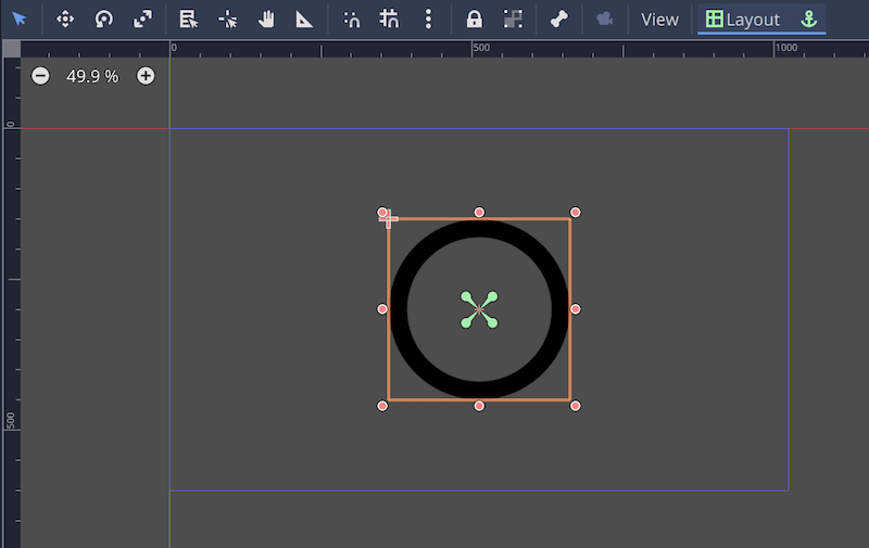
- In the 2D workspace, select “Full Screen” from the toolbar > “Layout”.
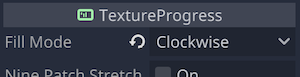
TextureProgress node
- In the Inspector, set the “Fill Mode” property to “Clockwise”. This is the style in which the progress bar progresses in a clockwise direction. Be sure to select this property appropriately for the shape of the progress bar. For example, if you have a heart-shaped progress bar, “Bottom to Top” would be appropriate, where the bar progresses from bottom to top.
- Drag and apply the image resource “res://Textures/CircularProgressBar.png” imported earlier to the “Texture” > “Under” property.
- Do the same for the “Texture” > “Progress” property.
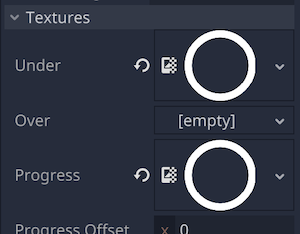
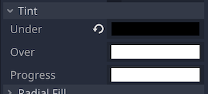
- Set the color of the Tint > Under property to #000000 (black).
- Leave the “Tint”>“Progress” property at the default color #ffffff (white) for the time being, even though it is not very appealing.
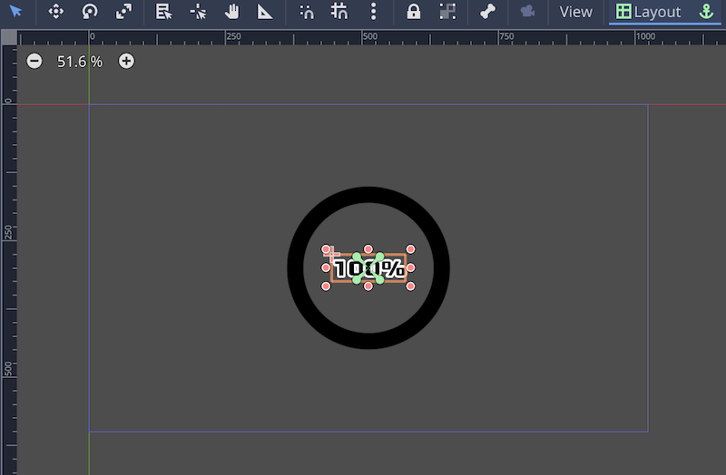
- In the 2D workspace, select “Center” from the toolbar > “Layout”.
Label node
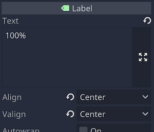
- In the inspector, enter an appropriate initial value such as “100%” for the “Text” property.
- Set the “Align” property to “Center”.
- Set the “Valign” property to “Center” as well.
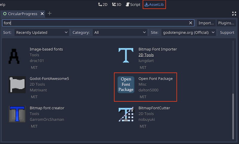
Downloading Open Font Package
Since we want to set a font for the “Label” node, let’s switch to the “Asset Library” tab at the top of the editor and download the “Open Font Package”.
- Click the “AssetLib” tab at the top and switch to “Asset Library.
- Search for “font” to find “Open Font Package” and click it.
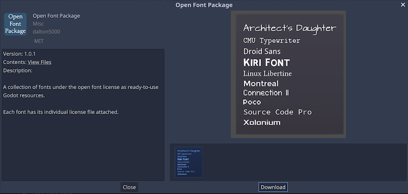
- Click “Download”.
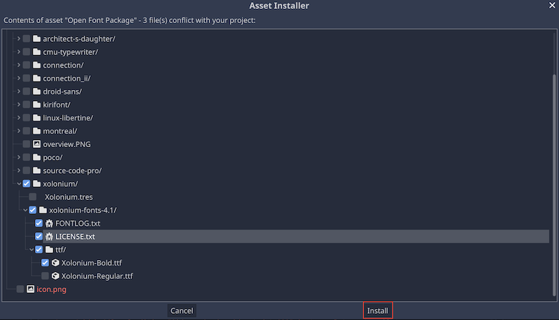
- Check only the necessary font files and click “Install”. This time, select “Xolonium-Bold.ttf”.
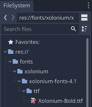
- If it appears in the file system dock, you are done.
Label node (continued)
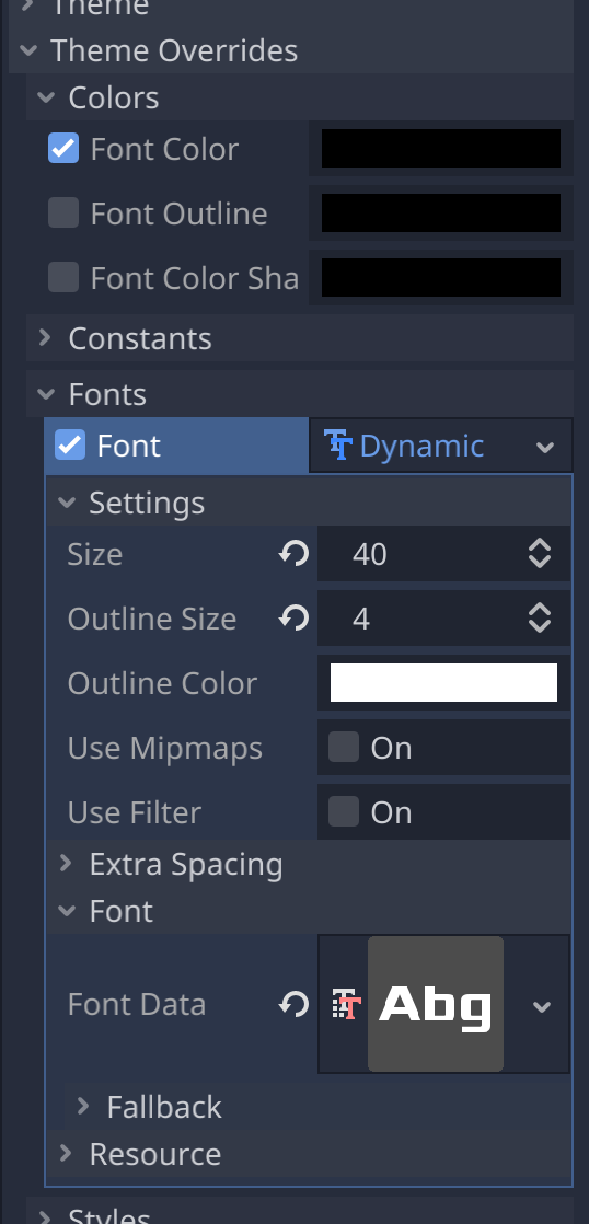
- Return to the inspector and apply a new “DynamicFont” to the “Theme Overrides” > “Fonts” > “Font” property.
- Expand the applied “DynamicFont” resource and apply the font resource “res://fonts/xolonium/xolonium-fonts-4.1/ttf/Xolonium-Bold. ttf” is applied.
- Set the “Settings” > “Size” property of the same “DynamicFont” resource to 40.
- Set the “Settings” > “Outline Size” property of the same “DynamicFont” resource to 4.
- Go back a little and enable “Theme Overrides” > “Colors” > “Font Color” and leave the color as #000000 (black).
- In the 2D workspace, select “Center” from the “Layout” on the toolbar.
Attaching and coding a script
Updating the progress bar with the up/down arrow keys
Let’s code a script to change the value of the progress bar with the up and down arrow keys on the keyboard. By changing the value of the “Value” property of the “TextureProgress” node, the display range of the “Texture” > “Progress” property will also change.
- Attach a script to the “CircularProgressBar” root node. Name the file “Progress.gd” and specify the file path as “res://Progress.gd”.
- When the editor opens, edit as follows.
###Progress.gd###
extends Control

# referencing the TextureProgress node
onready var progress_bar = $TextureProgress
# referencing a Label node
onready var label = $Label


func _ready():
    # reset the value property of the TextureProgress node to 0
	progress_bar.value = 0


func _process(delta):
    # call a method to process the input operation
	get_input()
    # call a method to update the Label node's Text property
	update_label()


# method to process the input operation
func get_input():
    # if we press the up arrow key
	if Input.is_action_pressed("ui_up"):
        # add 1 to the value of the Value property of the TextureProgress node
		progress_bar.value += 1
    # if we press the down arrow key
	if Input.is_action_pressed("ui_down"):
        # Minus 1 from the value of the Value property of the TextureProgress node
		progress_bar.value -= 1

# Method to update the text property of the Label node
func update_label():
    # Display the value of the Value property of the TextureProgress node with a %
	label.text = str(progress_bar.value) + "%"
Now let’s run the project and use the up and down arrow keys to change the value of the progress bar. If you are running the project for the first time, just set the current scene as the main scene in the dialog that prompts you to select the main scene.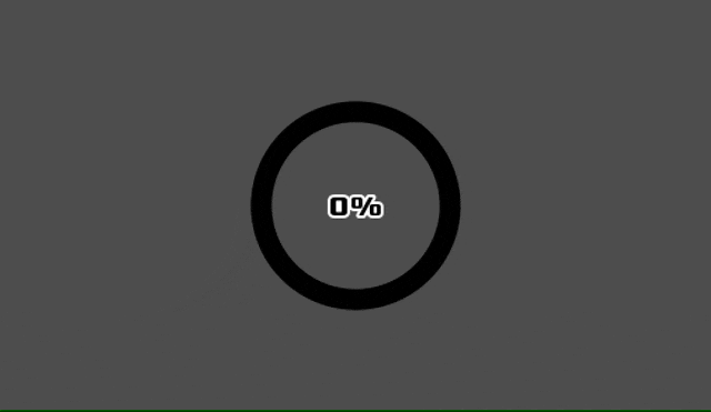
Changing the color of the progress bar
Since monochrome is not very appealing, let’s change the color of the progress bar as well. This time, we want the color of the progress bar to change gradually as the value of the progress bar changes. To make the update of the “Value” property of the “TextureProgress” node finer, let’s decrease the value of the “Step” property. In this case, we set it to 0.1.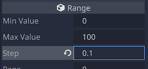
The script should be edited as follows.
###Progress.gd###
extends Control

# properties specifying the beginning and ending values of the h, s, and v properties of
# the tint_progress property of the TextureProgress node (color is specified by HSV)
export (float) var h_start = 0.0
export (float) var h_end = 0.45
export (float) var s_start = 0.3
export (float) var s_end = 1.0
export (float) var v_start = 0.3
export (float) var v_end = 1.0

onready var progress_bar = $TextureProgress
onready var label = $Label


func _ready():
	progress_bar.value = 0


func _process(delta):
	get_input()
	update_label()
    # Added: call a method to update color of the bar
	update_color()


func get_input():
	if Input.is_action_pressed("ui_up"):
		progress_bar.value += 1
	if Input.is_action_pressed("ui_down"):
		progress_bar.value -= 1


func update_label():
	label.text = str(progress_bar.value) + "%"

# Added: method to update color of the bar
func update_color():
    # Change the hue of the progress bar as the value of the Value property changes from min to max.
	progress_bar.tint_progress.h = range_lerp(progress_bar.value, progress_bar.min_value, progress_bar.max_value, h_start, h_end)
    # Change the saturation of the progress bar as the value of the Value property changes from min to max.
	progress_bar.tint_progress.s = range_lerp(progress_bar.value, progress_bar.min_value, progress_bar.max_value, s_start, s_end)
    # Change the brightness of the progress bar as the value of the Value property changes from min to max.
	progress_bar.tint_progress.v = range_lerp(progress_bar.value, progress_bar.min_value, progress_bar.max_value, v_start, v_end)
Now let’s run the project again.
Although a change in color would be beautiful, we want to keep in mind that the design is only for the game.
Progress bar in various shapes
As you may have noticed after implementing the above, a progress bar can be applied in various ways as long as you have the image resource that serves as the shape of the progress bar.
By duplicating “CircularProgressBar.tscn” and modifying its properties, it is relatively easy to create progress bars with various patterns. We have prepared some samples for your viewing.
Heart-shaped progress bar
Each property of “Script Variables” in the root node. Hue is from purple to red. Saturation and lightness are increased from the beginning.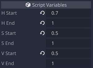
“Fill Mode” property of the “TextureProgress” node. Progress from bottom to top.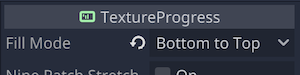
“Textures” > “Under”/“Progress” property of the “TextureProgress” node. Apply heart texture.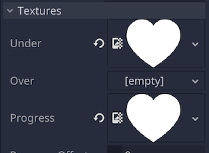
Run the scene.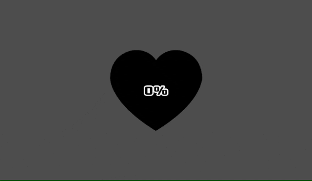
Skull-shaped progress bar
Each property of “Script Variables” in the root node. Hue is from green to blue. Saturation is kept low.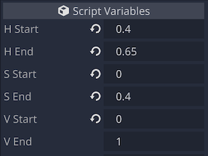
“Fill Mode” property of the “TextureProgress” node. Both up and down from the center.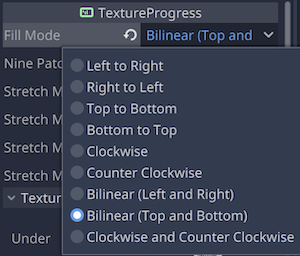
“Textures” > “Under” / “Progress” property of the “TextureProgress” node. Apply a skull type texture.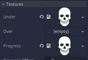
Run the scene.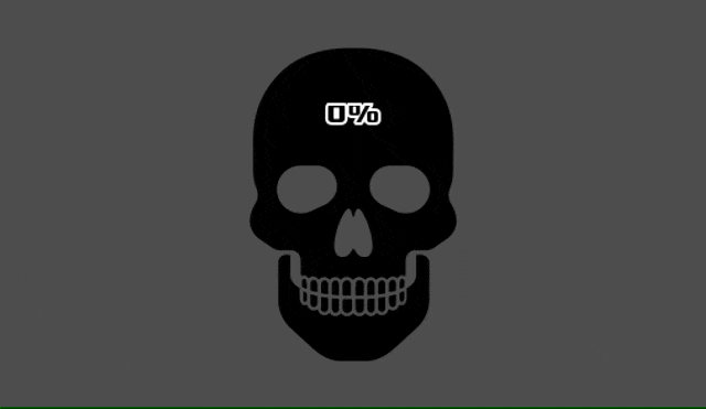
Flask progress bar
In this sample, the “Progress.gd’’ script is edited a bit.
### Progress.gd###

# Added: bar limit (default value is 100 to match max_value)
export (float) var value_limit = 100

# Methods for input operation processing
func get_input():
	if Input.is_action_pressed("ui_up"):
		progress_bar.value += 1
        # Added: only allow the bar to progress up to its limit value
		progress_bar.value = min(progress_bar.value, value_limit)
	if Input.is_action_pressed("ui_down"):
		progress_bar.value -= 1

# Method to update the text property of a Label node
func update_label():
    # Added: calculate Label's % with the bar's limit value as 1
	var actual_value = floor(progress_bar.value / value_limit * 100)
	label.text = str(actual_value) + "%"
Each property of “Script Variables” in the root node. Here, the value of the newly added property “Value Limit” is changed to 72.5. This is the value that corresponds to the top scale on the flask texture image that will be applied later.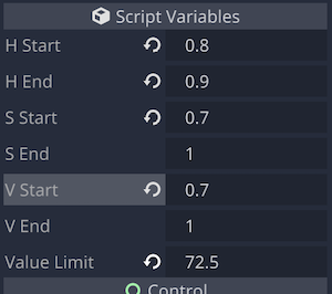
“Fill Mode” property of the “TextureProgress” node. From bottom to top.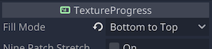
“Textures” > “Under” / “Progress” property of the “TextureProgress” node. Apply flask texture.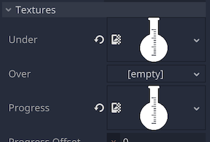
Run the scene. With the above adjustments, the bar stops progressing at the top scale of the flask texture.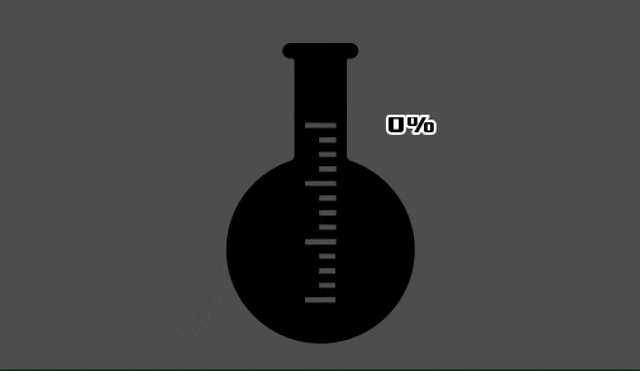
Brain Progress Bar.
Each property of the root node “Script Variables”.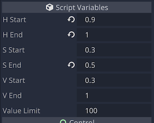
“Fill Mode” property of the “TextureProgress” node.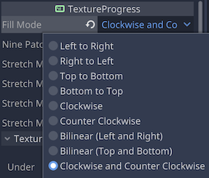
“Textures” > “Under” / “Progress” property of the “TextureProgress” node.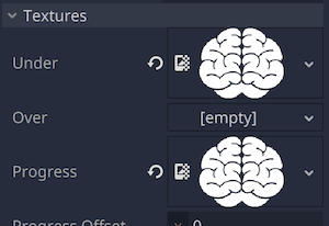
In the “TextureProgress” node, “Radial Fill” > “Fill Degrees” was set to 180, so that the maximum angle at which the progression bar can be expanded is 180°. The y value of “Center Offset” was set to 130 to shift the center of rotation of the progression bar to just below the brain texture.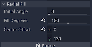
Run the scene.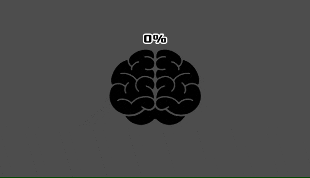
Let’s combine what we have created so far into one scene.
This is what it looks like when you run the project after changing the main scene settings.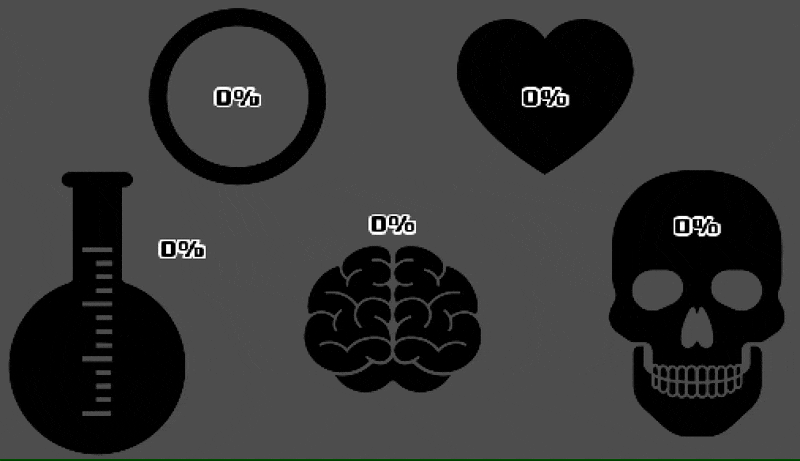
Conclusion
In this article, you learned how to create circular progress bars and other shapes of progress bars. The main points are as follows.
- The shape of the progress bar is determined by the image resource for the texture.
- The “Fill Mode” property of the “TextureProgress” node is used to set the direction of the bar’s progress according to its shape.
- By changing the value of the “Value” property of the “TextureProgress” node in a script, the progress bar can also be linked.
- By changing the color of the “Tint” > “Progress” property of the “TextureProgress” node in the script, the color of the bar can be changed according to its progress.
References
- YouTube: Godot Circle Progress Bar Chart
- YouTube: Creating a circular meter using a single Godot Control Node